This article is about the development of the design for Foosapp, our foosball app. The app was developed for both iOS and Android platforms with the assistance of two designers – one for each platform. What needs to be prepared and thought through before the designer starts to work? How much do they have to give in to the developers' objections to the solutions? What are the difficulties that both platforms inevitably bring and why do the iOS and Android designs differ?
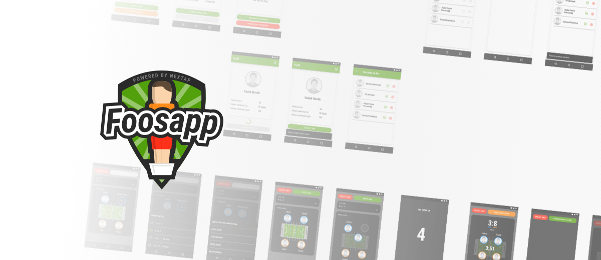
The first stepsOne of the first requirements is having a clear idea of the app's functionalities. These are written down in the specification which serves the designer as a kind of guideline, and then they start with wireframing. Wireframes are simple sketches containing a rough layout of the screens and indicating the flow of the app. The next phase consists of creating a clickable prototype created in the InVision program. This allows us to test the app's architecture, what button leads where and check whether the app is user-friendly.
Clickable prototypes„We played a foosball match with the clickable prototype and tested the flow and UX. Thanks to the possibility to have our hands on the "app" and to try it out we detected things which could be improved – such as moving the players in the teams from vertical to horizontal position so that the layout of the table on the screen corresponded with the layout of the real table,“ explains our designer Kája for whom this was the first experience with designing for the Android platform.
Colors, colors, colorsColors, app identity and logo. These are three very important things, maybe even the most important. Well combined colors and style are the first things which catch the prospective user's attention. The colors need to go hand in hand with the app's content, the font must be readable and the logo apt and clear. Everything has to match. It's not an easy thing. However, brainstorming is possible even when queuing for groceries so it didn't take David the designer long to come up with a great idea. Foosapp's identity was born!
Like two peas in the pod? No!It is great when the Android version's architecture matches that of the iOS version, but it isn't really fitting for the apps to look identical. And for a simple reason. Each platform is built on certain characteristic elements that their users are used to. For example, on Android, the back button is at the bottom as well as at the top, on iOS it's only at the top. The designer must take these characteristics elements into account when designing. However, there are guideline systems for designers to help them – for Android, it's Google's Material Design, for iOS, it's Apple's Human Interface Guidelines.
"Reviews are important, four eyes see more than two"In order for our app to look as similar as possible, our designers came up with a strategy. The iOS version was to be created first and would serve as a model for the Android version. Even though both designers were busy with their platform, they reviewed the work of each other.
The designers use the Sketch app for designing, then they export the finished designs into Zeplin and finally, it's the developers' turn. They take the elements' properties (such as sizes, colors and other characteristics) and use them in their programming software so that the model matches the actual result. However, it's always good to check the UI implementation against the model in Zeplin so that any inaccuracies are eliminated. Now, the designer's work can be considered done.
It shouldn't hurtTo satisfy both sides, designers should consult their solution with developers. ,,Most of the time, it's not like the designer comes up with a perfect solution and everything goes according to the plan. When designing Foosapp we encountered a problem with Material Design – a new version updating the guidelines (for example, Material Design v2 prefers rounded edges to sharp) became available for designers, but most of the updated Material Design elements weren't ready for implementation by developers. In our case, it was either to do it manually and spend much more time doing so or make a compromise. In the end, it was better to compromise,“ says Kája.
Changing things as we went"During the app development, we had to make some changes in the design because we'd encountered some unforeseen specific situations which had to be dealt with, such as the socket connection errors or sound settings. We had to implement an indicator for when sockets disconnect, and an icon which mutes or enables sound effects, respectively." However, as long as there are plans to further extend the app, the designer's work is far from done.
Would you like to play foosball with our Foosapp app? Follow #foosapp! Find out more at www.foosapp.eu.